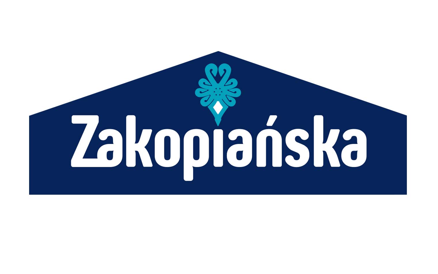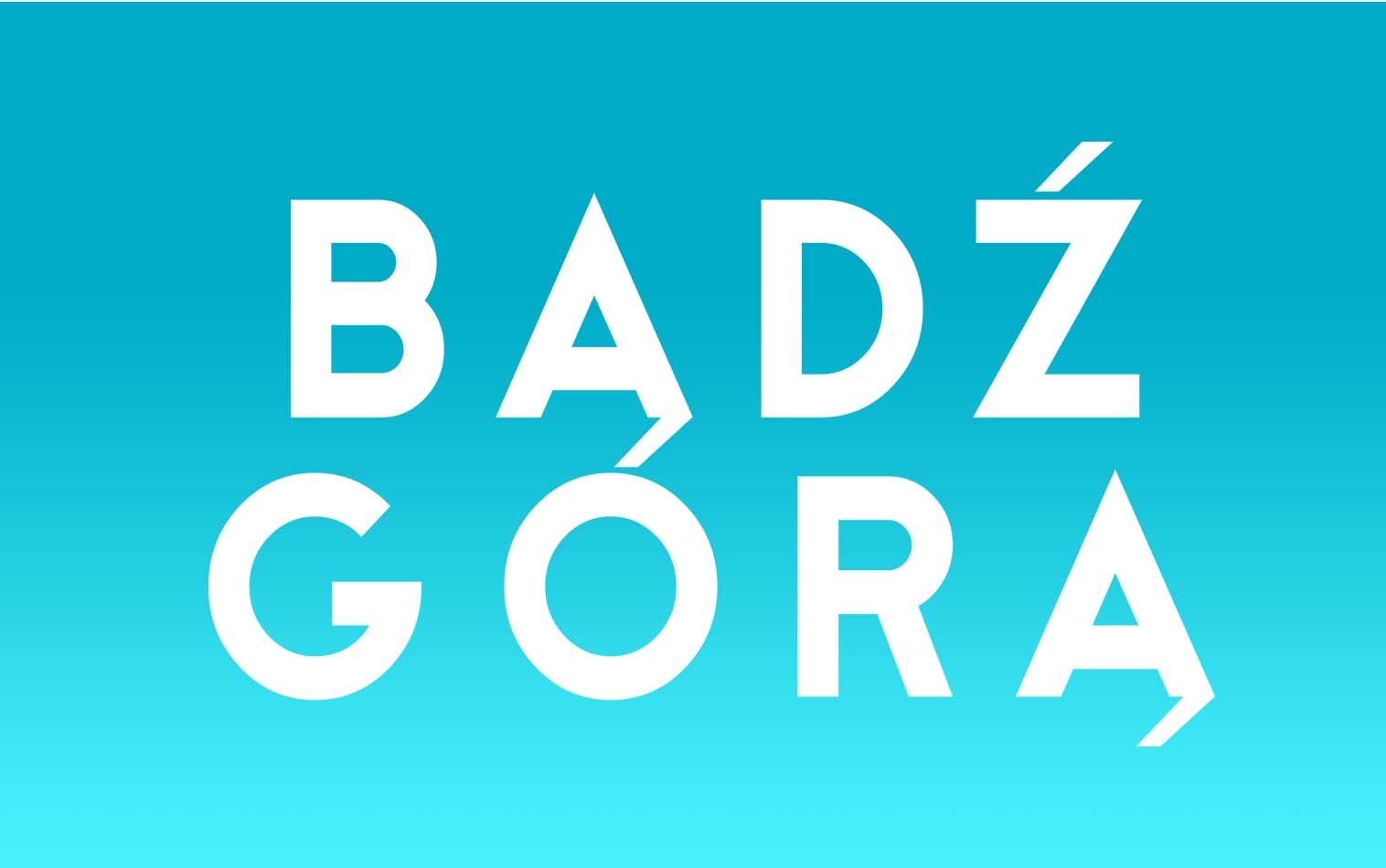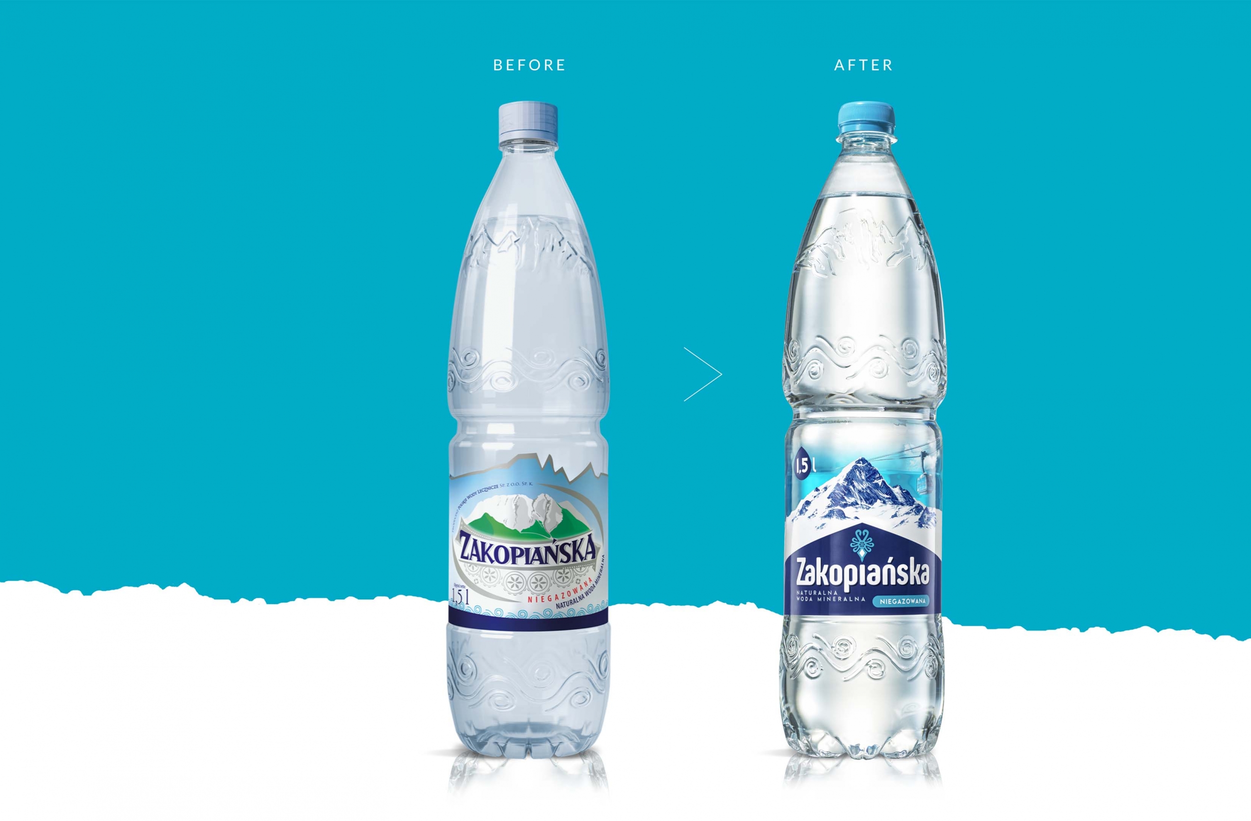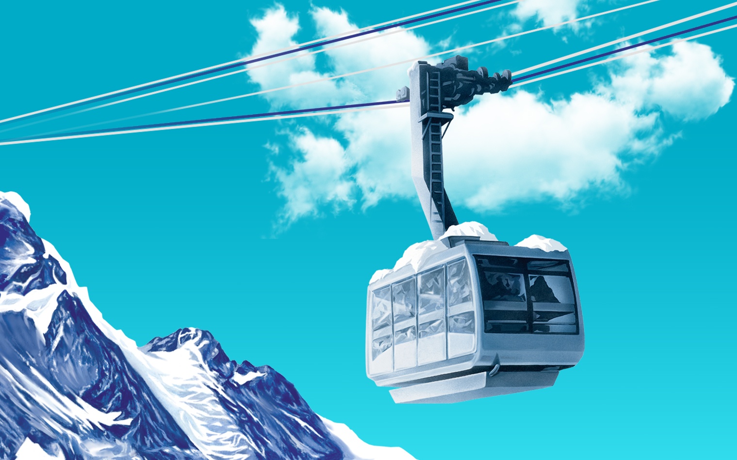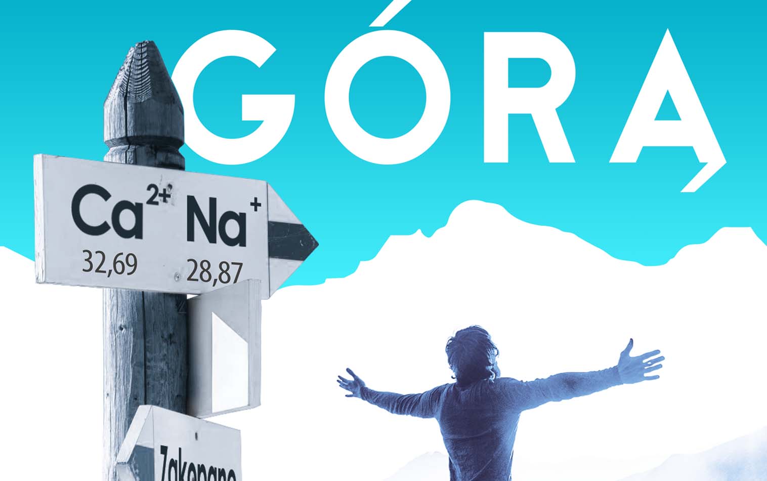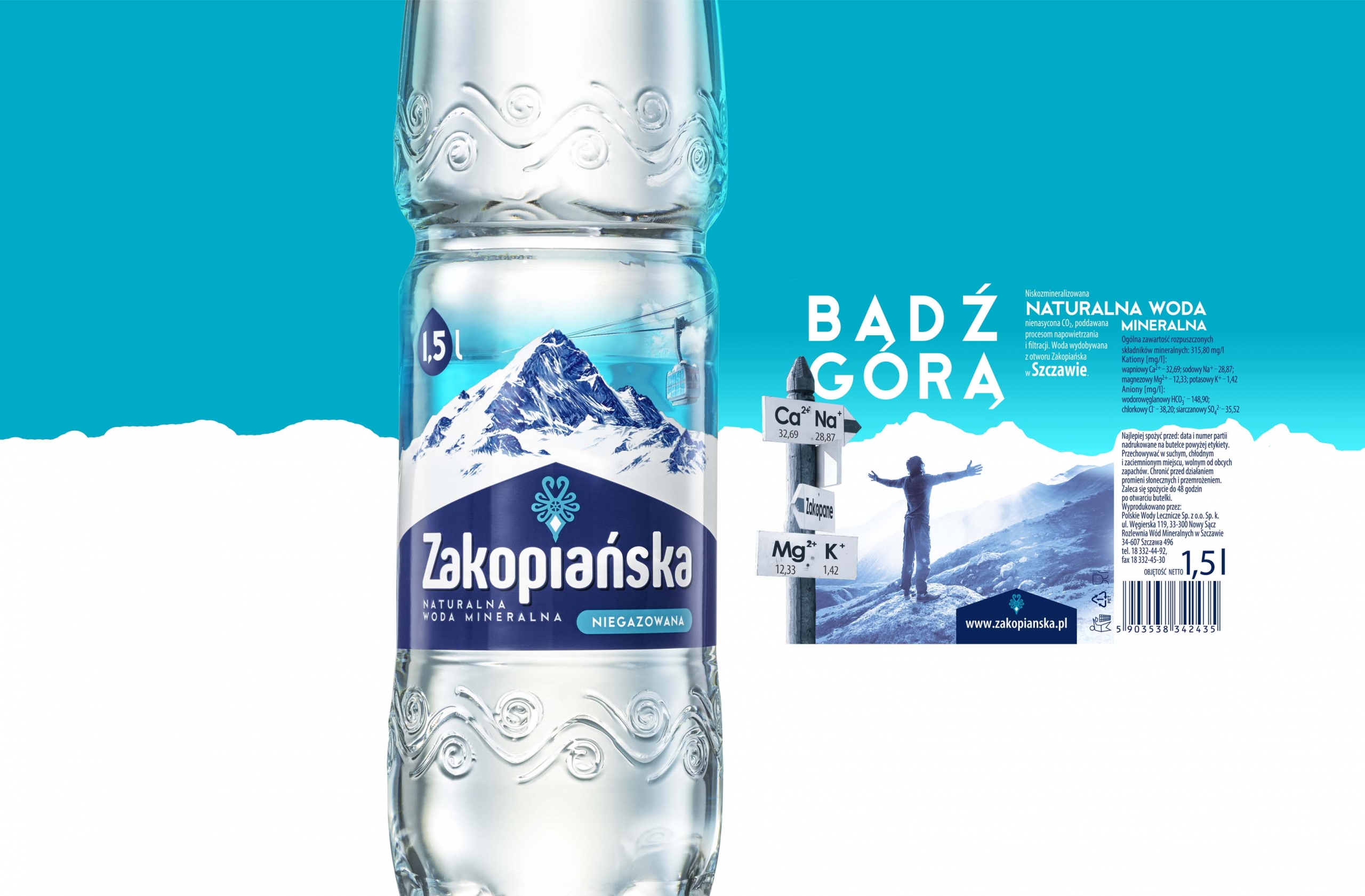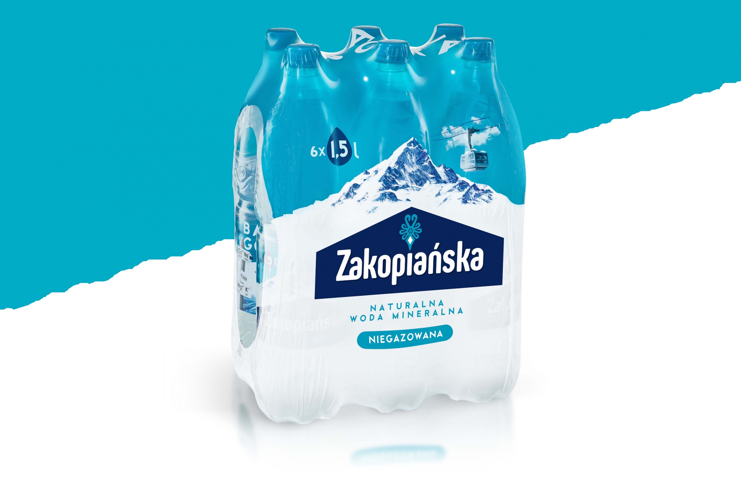
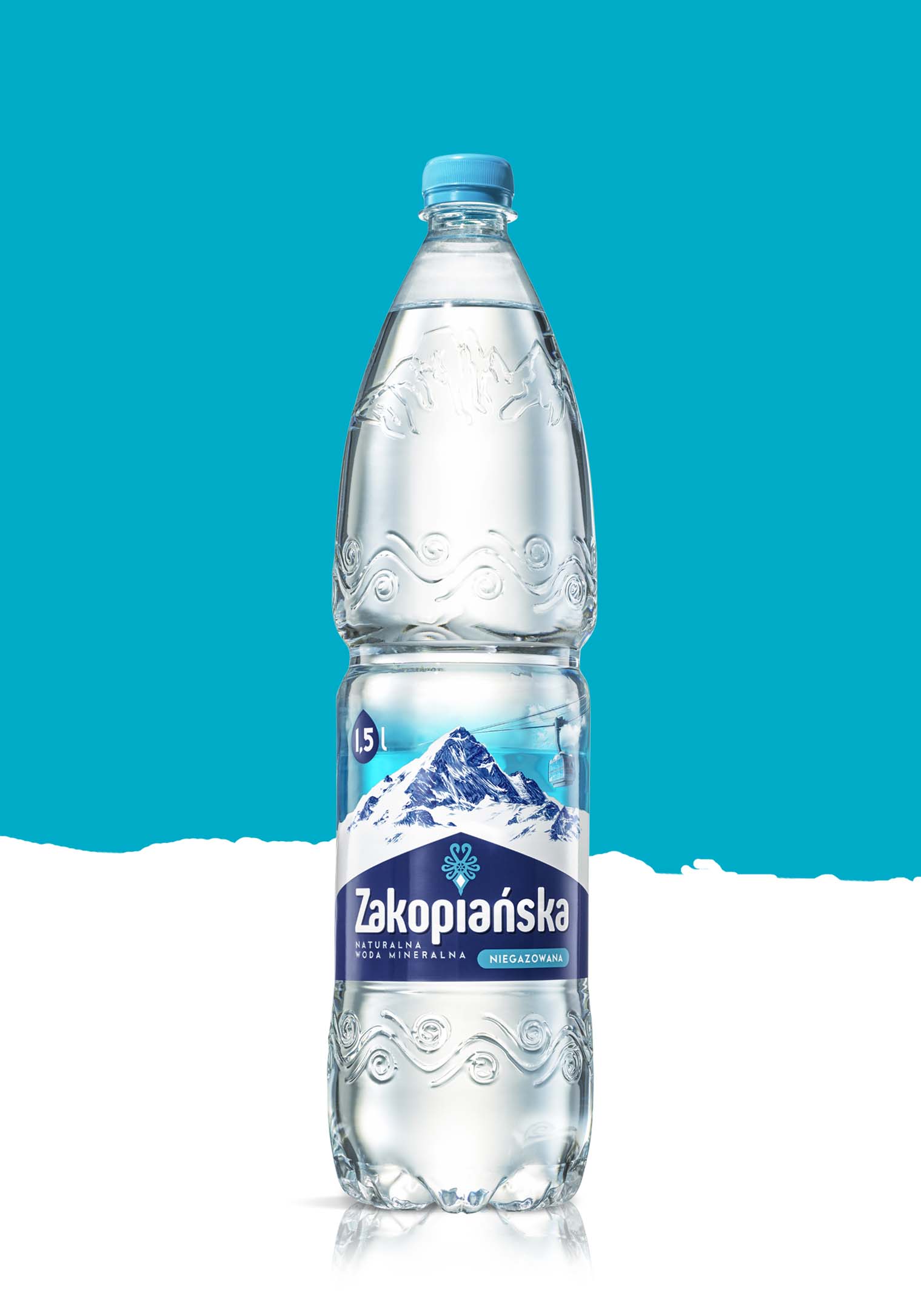
The most recent rebranding of the Zakopiańska water redefines the product. A modern logo based on a traditional folk pattern and the illustration of a wintery landscape both emphasize the Tatra pedigree and character of the water. The catchy brand claim is a pun referencing the mountain origin of the product, as well as invoking the idea of success.
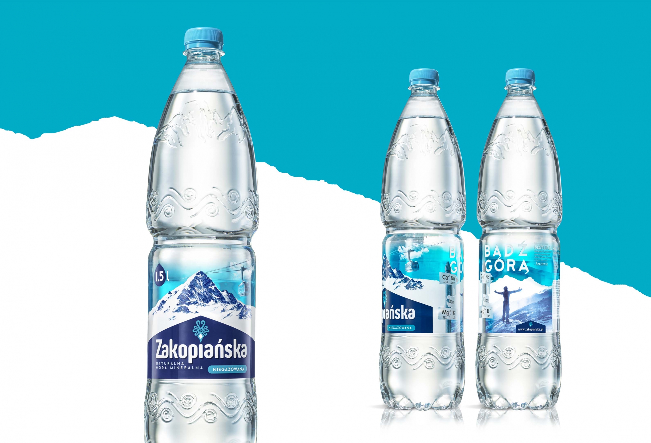
The label is integrated with the bottle and designed to be viewed at full 360°. Partial transparency and purposefully designed composition increase the 3D feel of the packaging.