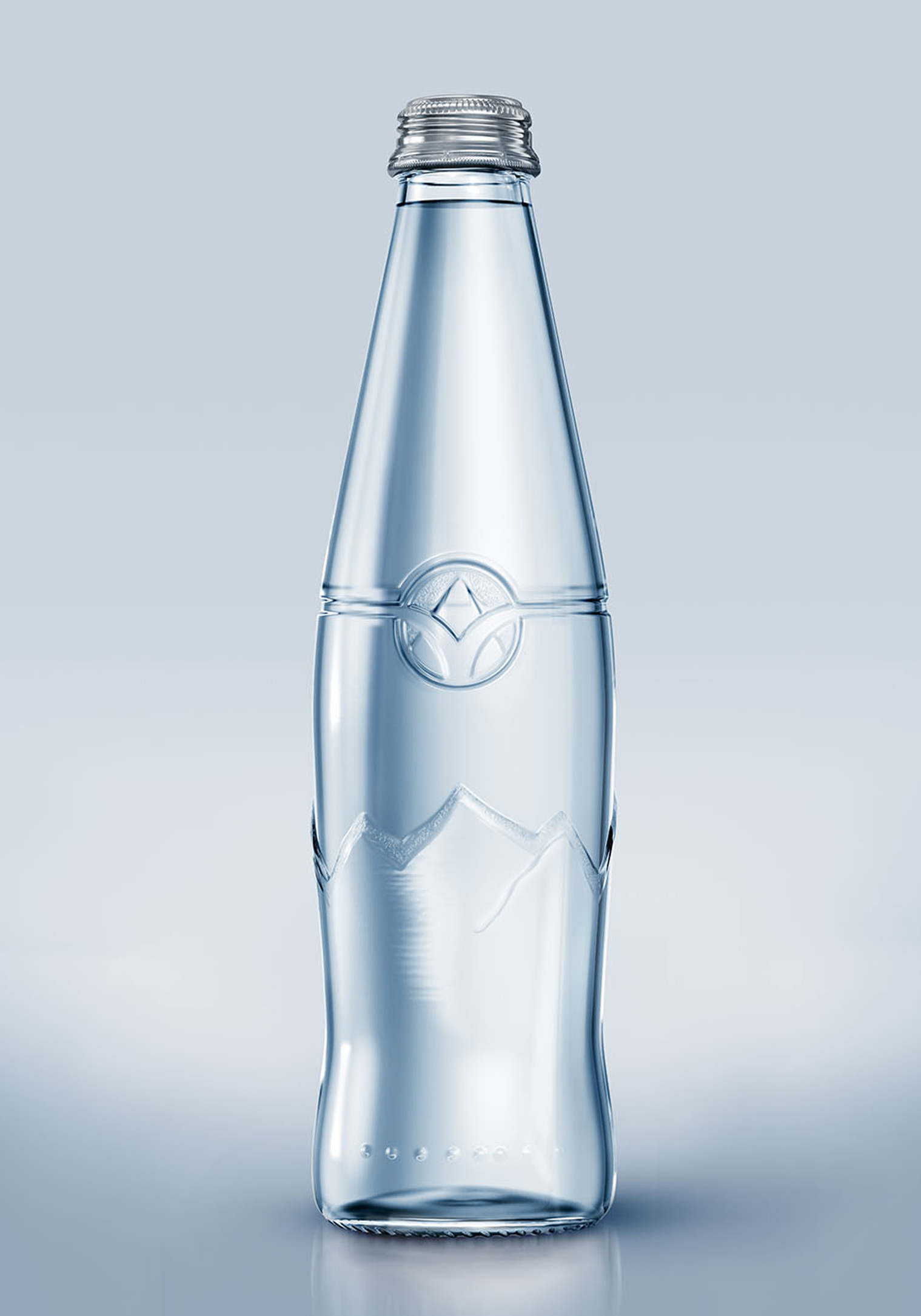
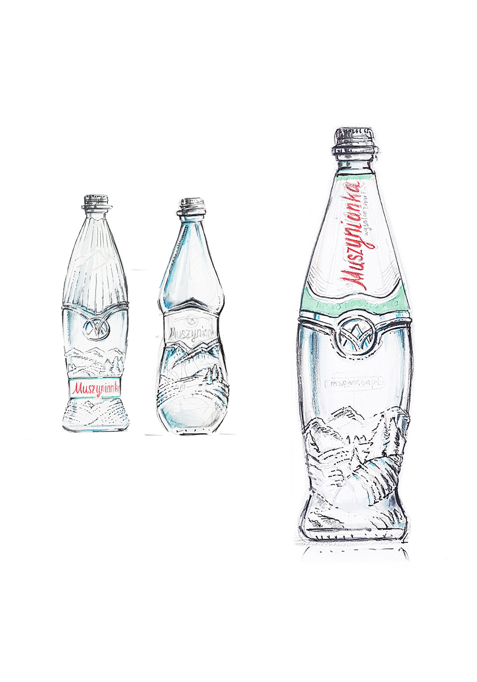
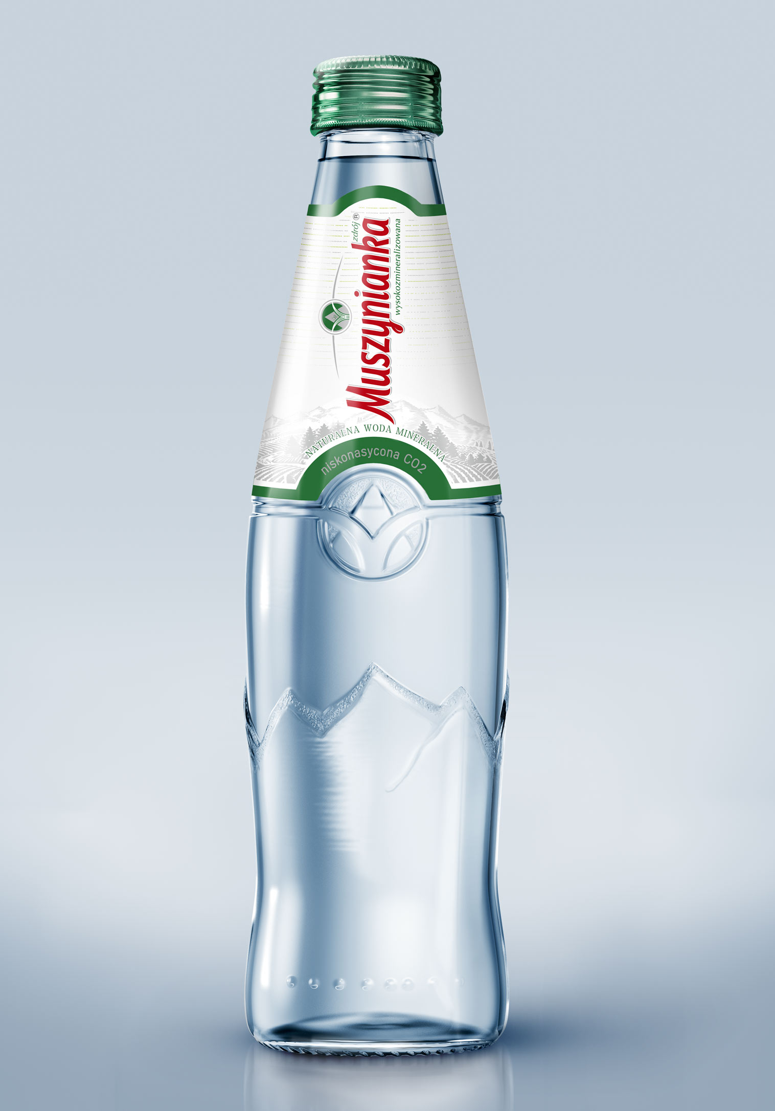
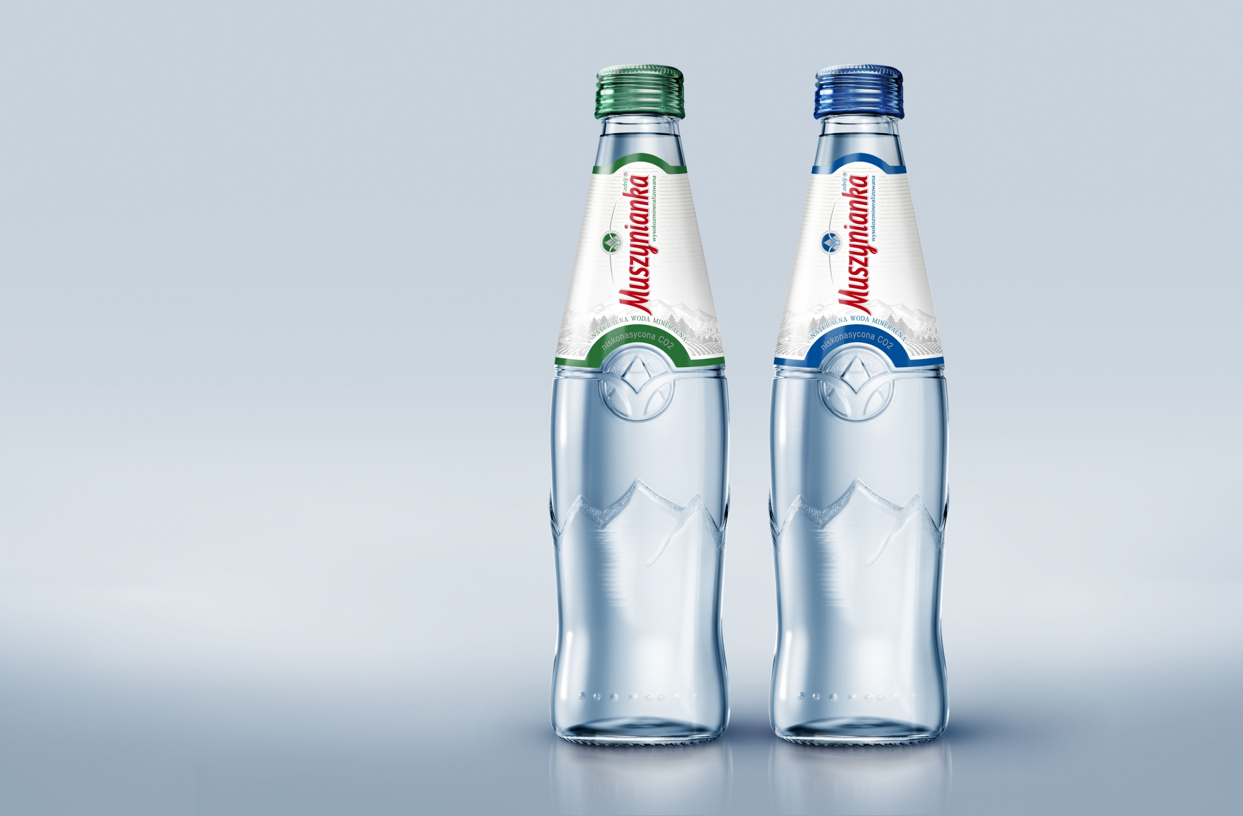
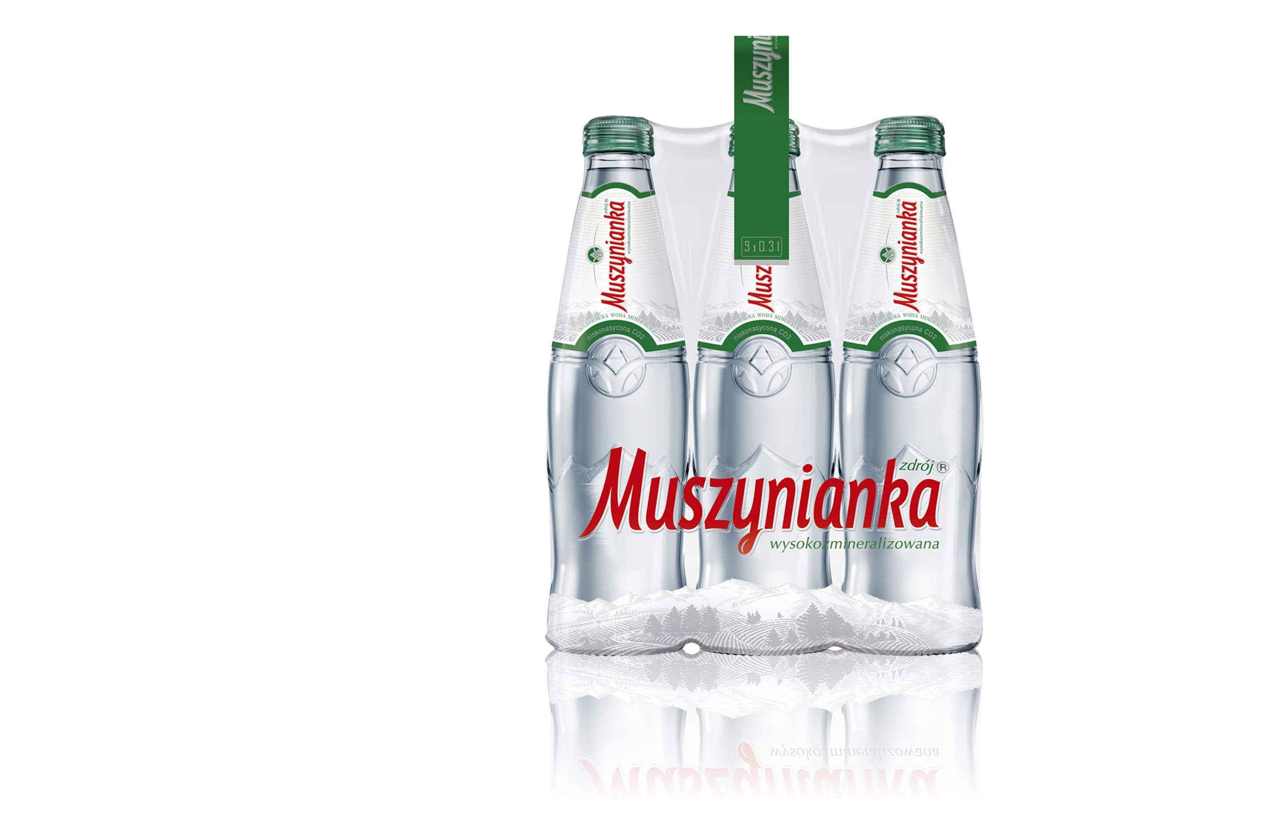
Our take on the Muszynianka mineral water, adapted for a premium-type glass bottle.
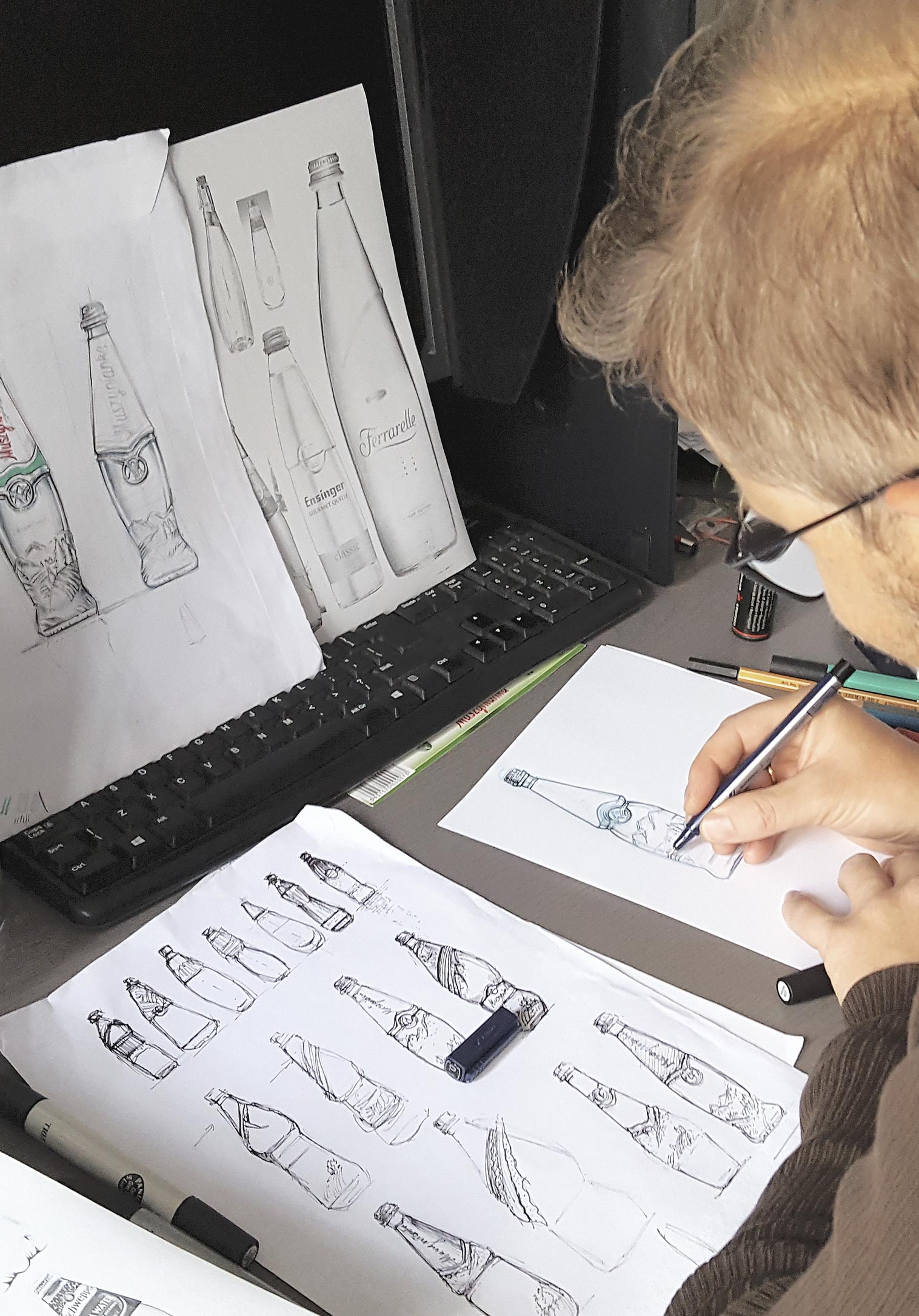
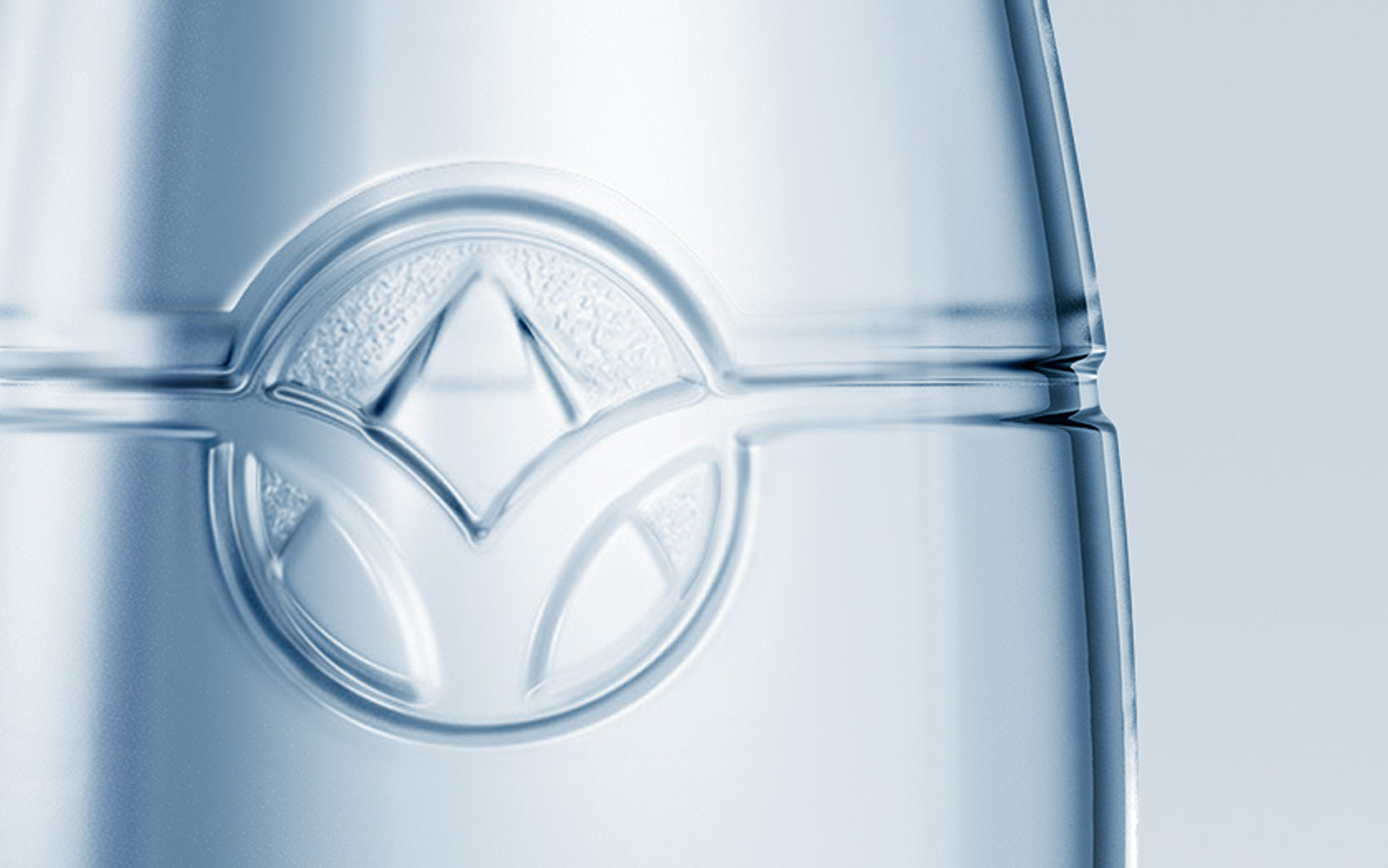
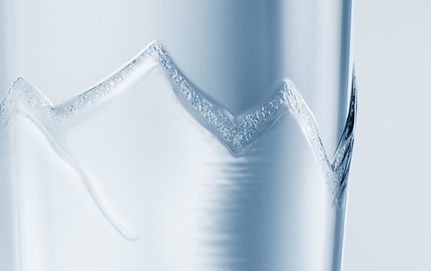
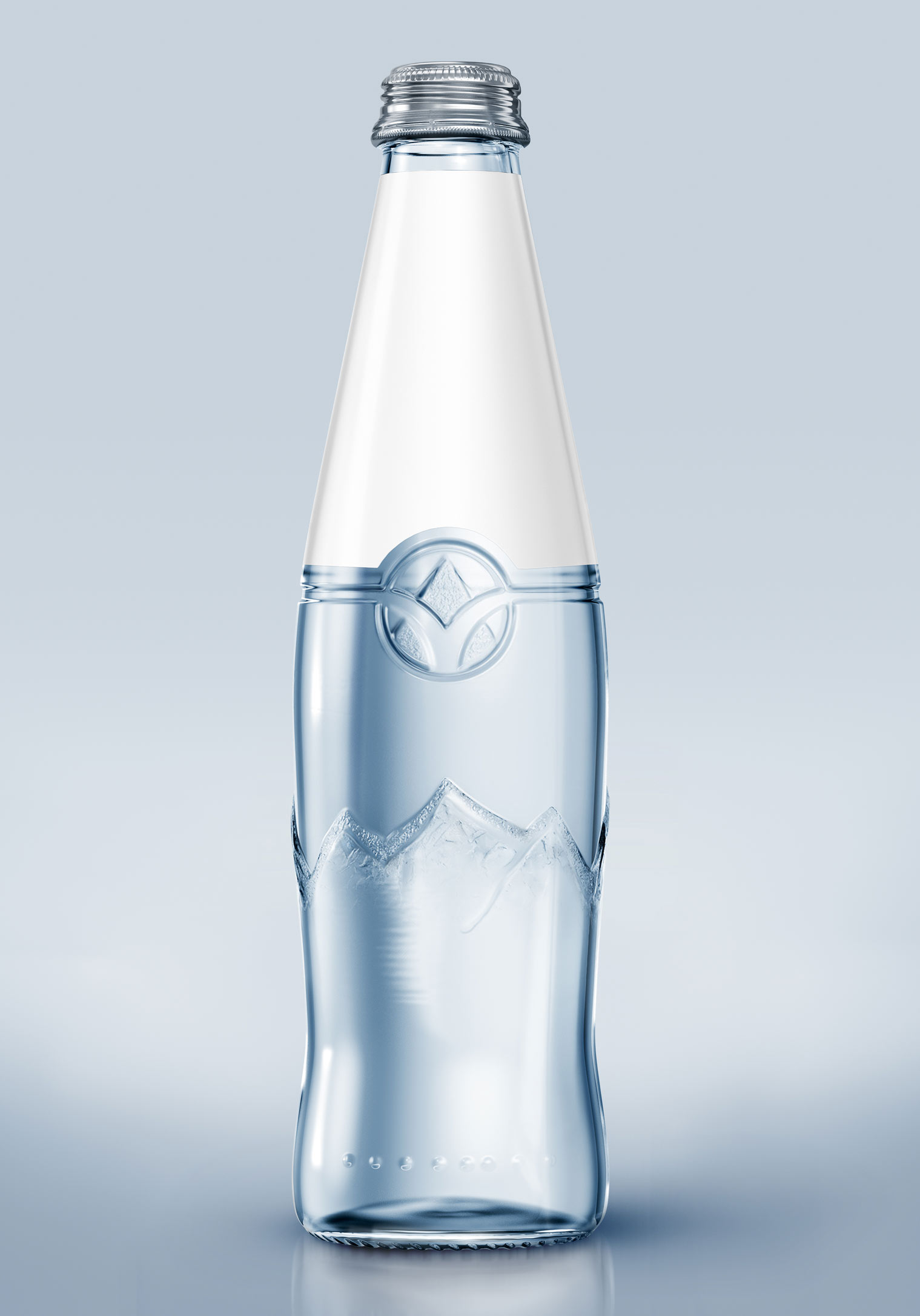
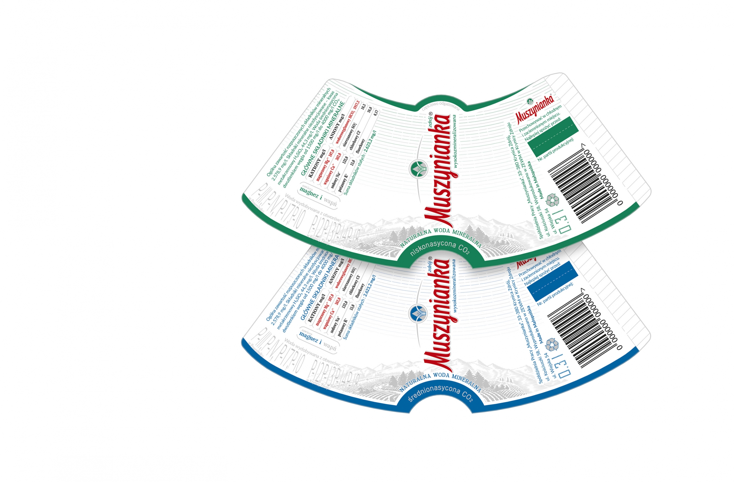
An all-round type of design included reimagining of the bottle itself, which went against the grain and avoided commonly adapted drop-shaped containers, popular throughout the market. Emphasising the logo and the positioning of the label was another crucial element, hence the vertical orientation of text.
Technological limitations and production costs were important considerations for the client, yet despite these hurdles, which prohibited the use of engraving, we managed to create a unique and readily recognisable design.
