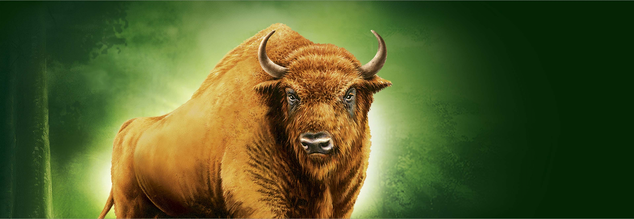
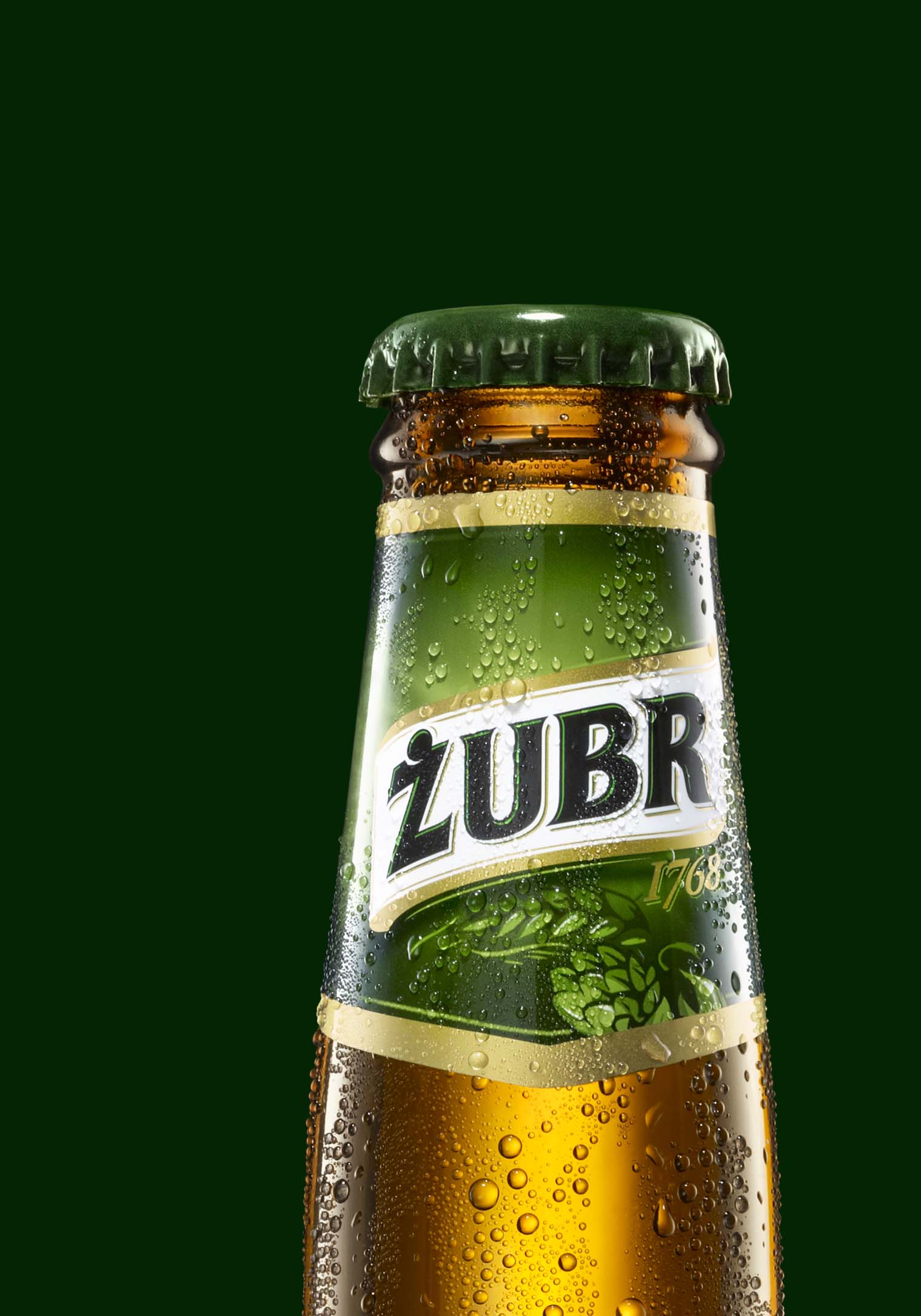
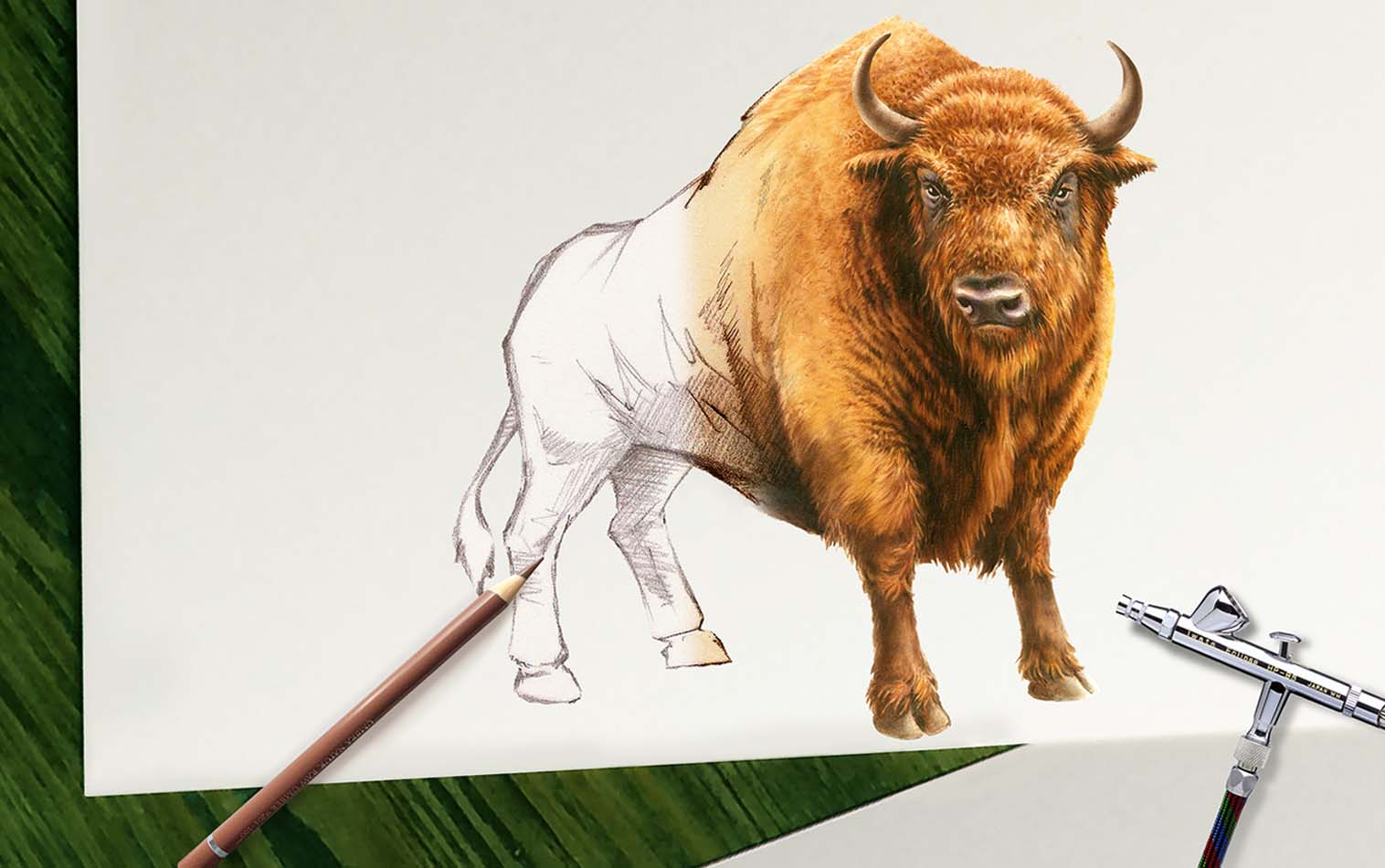
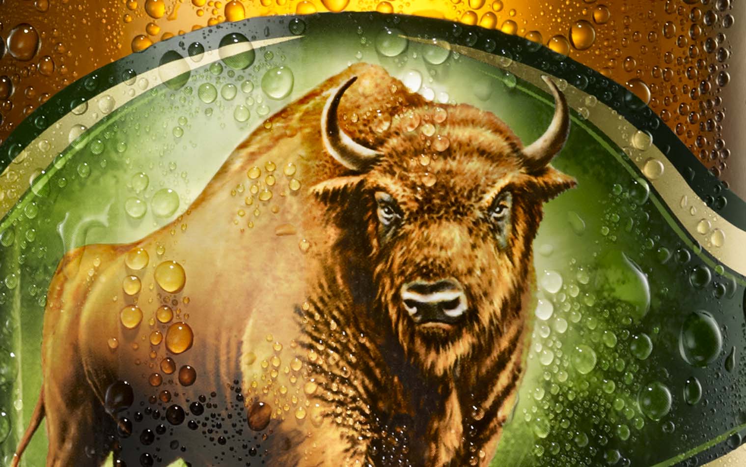
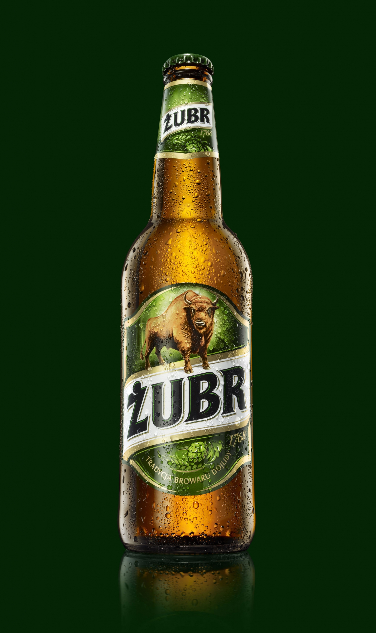
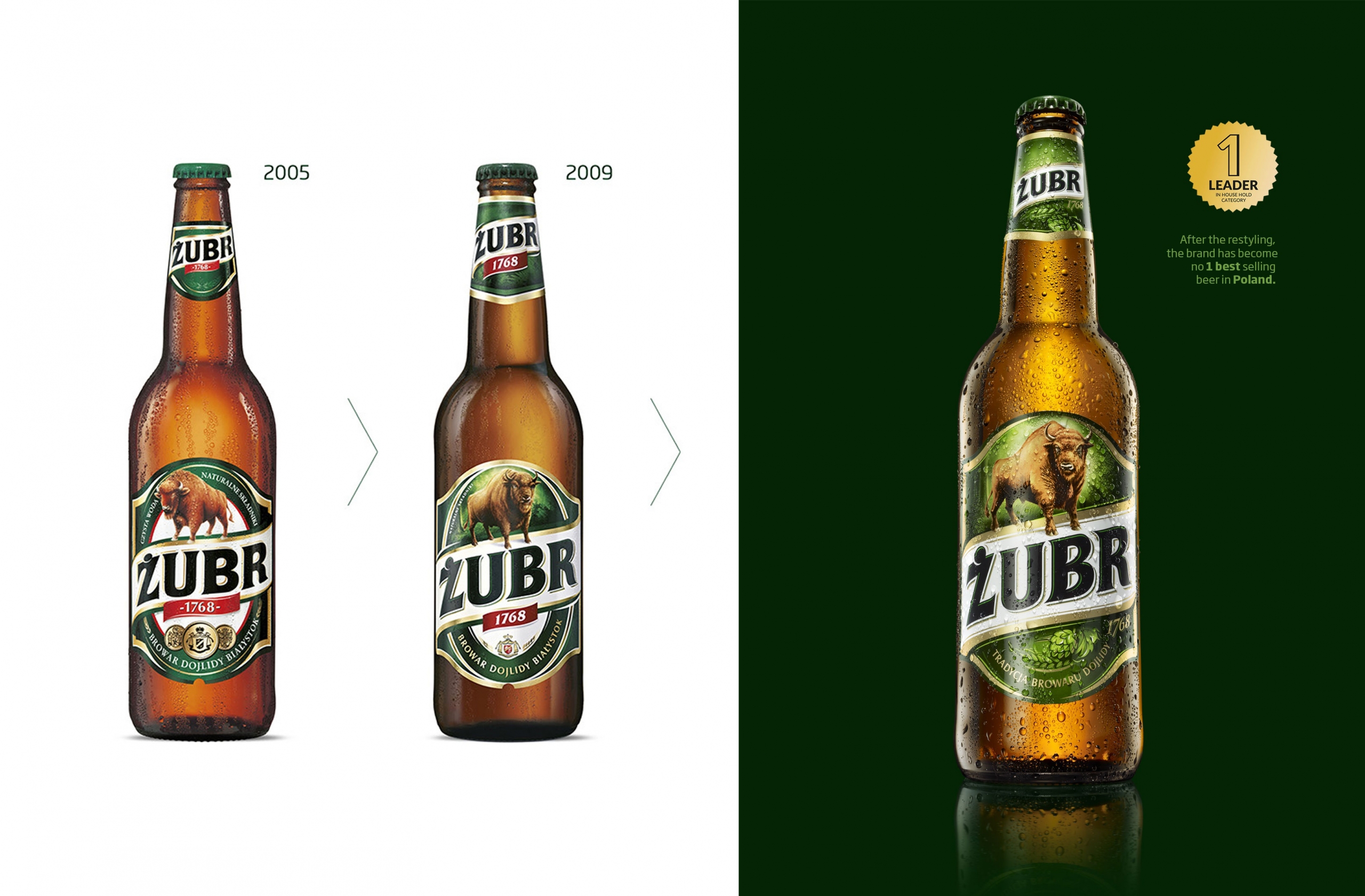
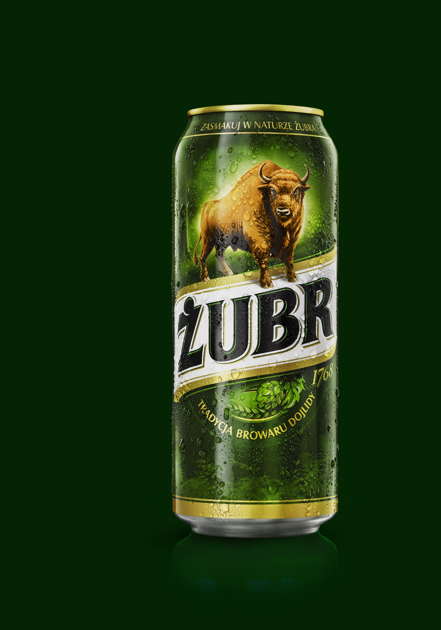
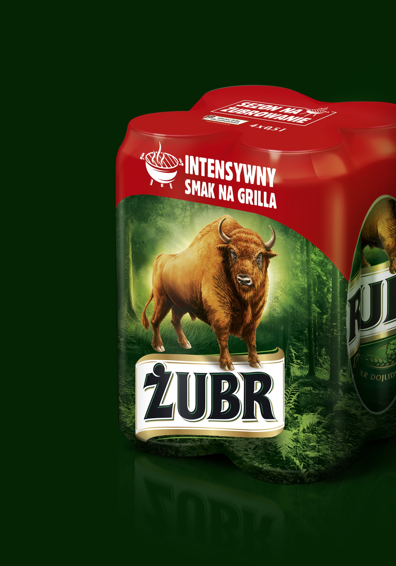
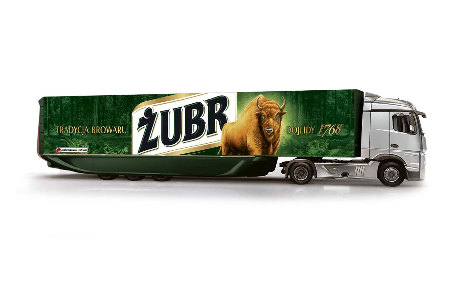
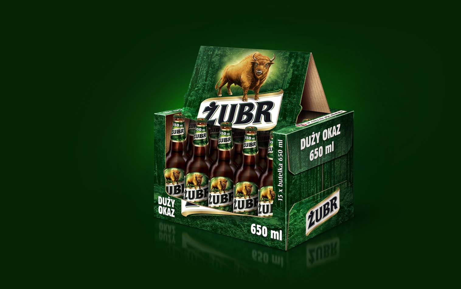
Our second rebranding of the popular Żubr beer. The client (Kompania Piwowarska S.A. SAB Miller) decided to draw attention to the silhouette of the bison, emphasizing its character.
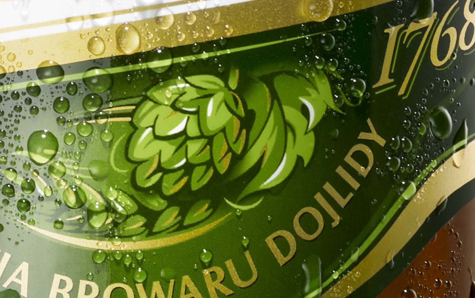
Following the ‘less is more’ rule, we limited the amount of detail on the label and made the bison a centerpiece figure, ruling over the entire forest. We also placed the bison silhouette on the bottle cap. Though the changes were significant, they had clearly evolved from previous iterations of the packaging.
